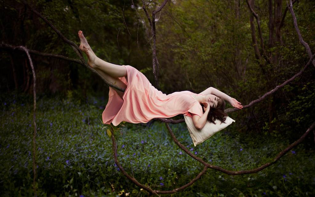
So this is kind of on the opposite end of the spectrum of my last photo crush post. My last post was more about natural beauty and just capturing it, and this is more looking at photography in an artistic sense; like "painting" something out of real live objects. Oh, and with photoshop, haha. I love levitation shots because they can portray so many types of different moods. You can go creepy or dark with it (which I'll talk about in a bit) or go calm and whimsical, like the picture above.


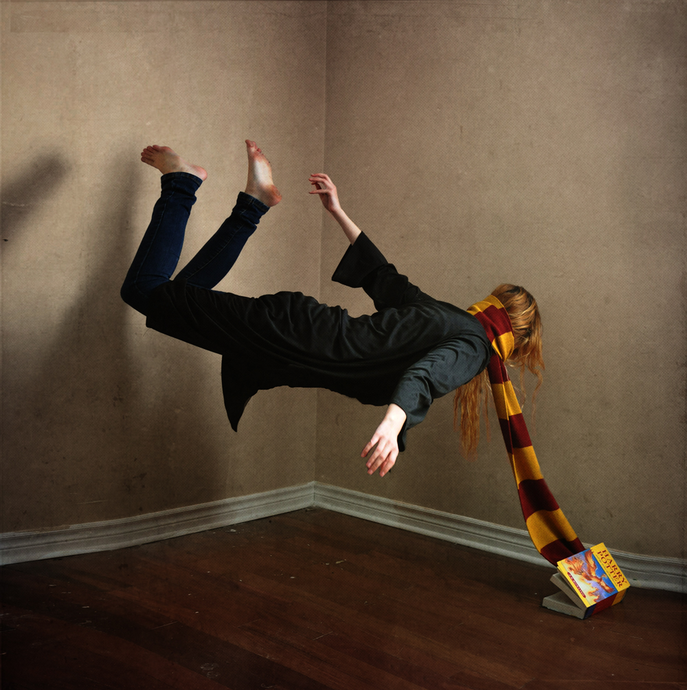
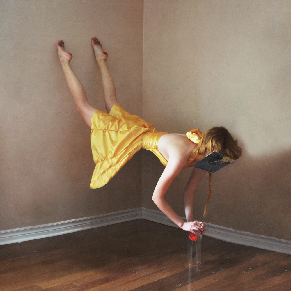
One of my favorite series, called "Get Back In Your Book" by Lissy Elle Laricchia, goes a little darker with the concept. I absolutely love these photos. It compounds on the idea of the "whimsicalness" (if that's a word...) of fairy tales or novels, and brings them into the real world, giving it a jarring affect. She also uses the shadows/textures very well, so the first thing you're thinking isn't "Wow, now that's a cool photoshop effect." Of course, it is, but she's only using it as a tool to tell a story.

Here was one of my first shots at levitation. It's not a full levitation, but I liked the effect of looking like you are being "pulled" off the ground. I was inspired by this picture (look around on this girl's flickr page, she has great levitation shots too, as well as just cool/inspiring photos!).
So if you are curious as how to create these kind of photos, there are a few ways to do it. The basis of both is to have your model (or yourself) balancing on a stool, chair, box, anything that will raise them (or a part of them) off the ground. Whatever you're using should be simple looking if possible (not a bunch of crazy colors or something extremely odd shaped; I'll get to why in a minute.) The method that I like to use, is you take two photos: one of the model being held up, and another of just the surroundings, without your subject. The key is to make sure the pictures line up very close (I don't say "exact", because it is usually possible to fix a few errors in post-editing.) Then, in photoshop, you take the two photos and layer them on top of each other, with the "blank" one (without the subject) on the bottom. Then you can erase the object that the subject is resting on, but you still get what's underneath it from the base picture. This is why I suggest something simple, so it is easier to erase and edit around. Another method some people use is only taking one photo (the one with the model), and using the clone stamp tool in photoshop to edit out the stool/chair/object. This works fine too, but I prefer using the base picture because it is more likely to look more natural.
Thats the same trick I use when doing multiples (such as this photo). I think it's a fun and interesting way to enhance your photography. And plus, of course, it looks freakin' bitchin'.
Hope you enjoyed my rant. Hopefully it was slightly coherent. I have a tendency to ramble on and on about things and then realize later that what I said didn't make any sense at all. Ah, well :)
Hoping you are having a happy wednesday!
♥


this is so cool! none of these pictures look photoshopped at all. i especially like the last one- the girl levitating over her bed :) x
ReplyDeleteWow, I really like the book ones! What a cool effect!
ReplyDelete